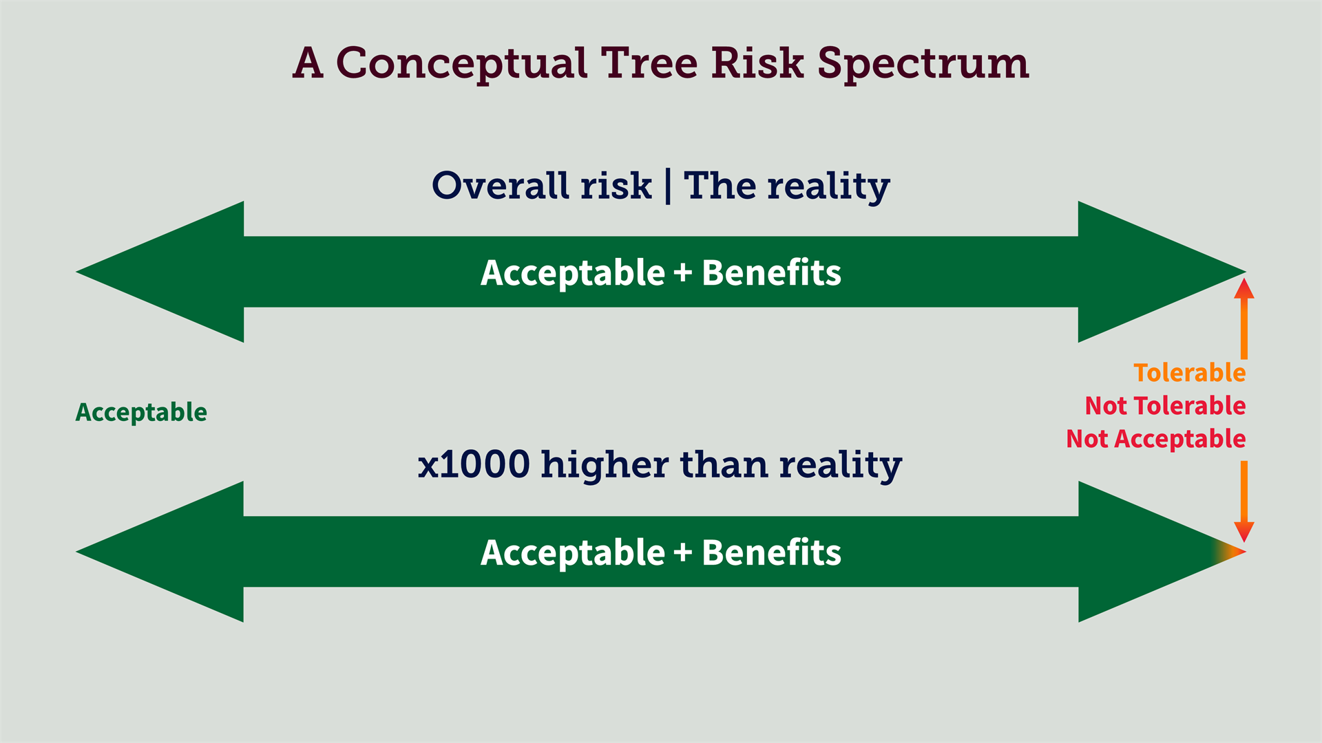
We regularly use visuals to convey both the context of tree risk and how you can measure it. Recently, we shared a post with Professor David Ball's quote that the prospects of reducing the risk below the current level were comparable to finding a microscopic needle in a gargantuan haystack.
To help convey that finding a microscopic needle in a gargantuan haystack simile further, we've had a play around with illustrating the tree risk context using coloured spectrums.
In the graphic, the top spectrum shows the reality of tree risk to scale. We know that compared to other everyday risks we readily accept, the overall risk to us from branches or trees falling is extremely low. Our annual risk of being killed or seriously injured is less than one in a million. At this scale, we can't see the amber and red risks. We'd need a microscopic.
If we take the risk spectrum to a scale where we can just make out the risks that we're trying to find and manage, we have to overvalue the base-rate risk by a factor of more than 1000.


.png)